Hesitant about colour? When it comes to your home, you should lead from the heart, not the head.
Choosing a pared-back yet powerful colour palette allows you to make your home truly personal. Think of a colour palette as putting together a beautiful meal, choose one main and then add mid-tones, contrasts and echoes through the room. Here are a few striking examples to get you started.
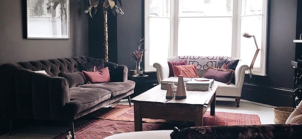
Kate Watson Smyth’s chocolate lounge
Going for an unconventional colour, yet keeping it effortlessly stylish; interior stylist Kate Watson-Smyth evokes a sumptuous dark chocolate for her lounge which maintains a warm welcome whilst being wonderfully unique and stylish.
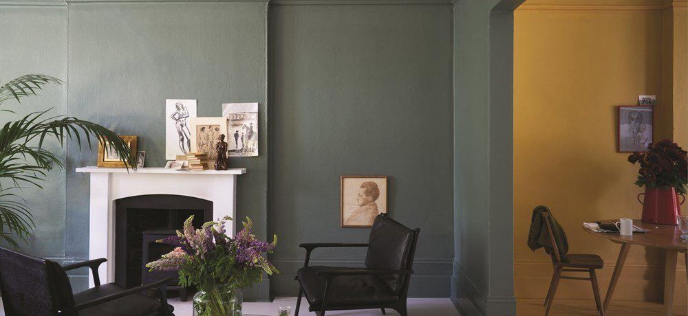
Farrow and Ball’s Living room
painted in Wimborne White No.239, Green Smoke No.47 | Estate Emulsion; Green Smoke No.47 Darker tones can give living rooms magical qualities, especially in the evening light. This slightly muted mid green echoes traditional tones, but the deeply saturated colour makes it the perfect backdrop for contemporary homes. Add a modern edge with glossy black accessories or a rich yellow, but always make sure you choose a mineral-based paint - as the light changes, the colours will transition and change, bringing your rooms to life.
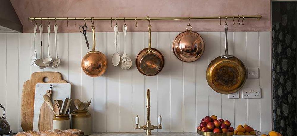
Pink Plaster Kitchen by Jersey Ice Cream Co
For a completely stripped back aesthetic (literally) why not try pink plaster tones in your home? Dusky pinks like ‘Setting Plaster’ by Farrow and Ball are named after the blushing walls we often admire in newly plastered houses. It’s definitely a pink, but creates a softer, warmer ambiance in any environment thanks to a touch of yellow pigment. These dusky pinks can be a wonderful backdrop for antique furniture and warm copper or mid-grey tones. Think of it as the seemingly effortless ‘I woke up like this’ look for your home.
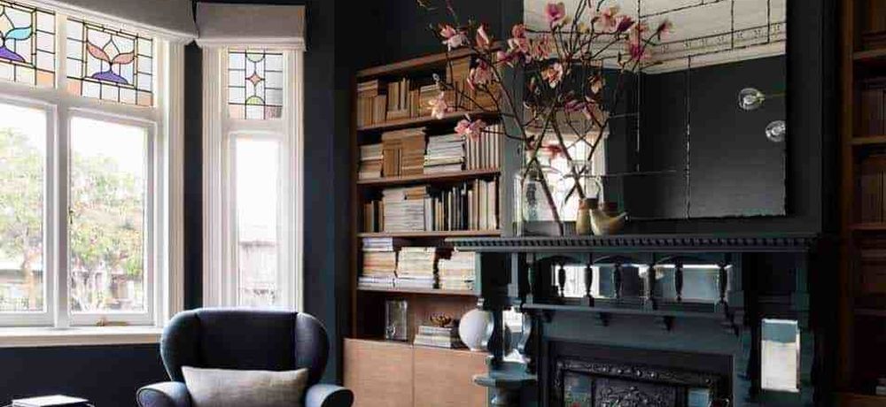
Black Walls at the Parlour by Pipkorn Kilpatrick
Once only reserved for bedrooms of goth teens, black walls are fast gaining popularity as a rebellious reaction to the clinical ‘all-white’ aesthetic of the past decade.
Black is always more than just one colour. Painter Pierre Soulage, who works exclusively with black paint, explains in a recent New York Times interview: “Black is never the same because light changes it. There are nuances between the blacks. I paint with black but I’m working with light. I’m really working with the light more than with the paint.” When painting with black, always use a mineral-paint to experience all the changing nuances for yourself. Like the room pictured, natural light always helps to show off the many colour tones in any black, from midnight blue to darkest greens.
Perry Rise – The Design House by 2LG Studio
Looking for a crash course in colour? The team at 2LG Studio really know how to incorporate bright and playful colours into spaces with the utmost class and style. By showcasing their own home as an exquisite example of what they can do with unconventional design and colour, they guarantee to put a smile on your face. This is a beautiful example of the importance of first knowing all the rules, and then knowing how to break them.


